Rekesz is a vibrant bar dedicated to the craft of great beer and quality food, offering a carefully curated selection of craft brews alongside freshly made, handmade burgers. Designed as a welcoming and social space, it brings together people from all walks of life who share a love for authentic flavors and relaxed, good company.
A key element of its identity is the bold illustration style used across its branding and packaging. The visuals feature expressive, character-driven designs that celebrate diversity, and individuality, reflecting the wide range of people who gather at the bar. The use of dynamic lines and playful compositions creates an energetic and contemporary feel, making the brand instantly recognizable and engaging.
Wrapping paper
The wrapping paper features a bold, continuous illustration where a diverse mix of characters flow seamlessly into one another, making it hard to tell where one person ends and the next begins. Figures intertwine, and collide in a dynamic composition that captures movement and connection.
Paper glass design
The paper cup design follows the same illustration style, featuring a young couple enjoying burgers and beer. The design was initially hand-drawn, giving it an authentic and organic feel, and later digitalised to refine the details and ensure clarity across the final product.
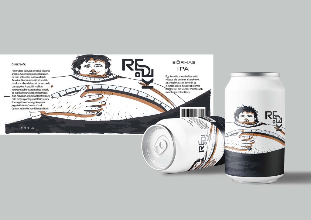
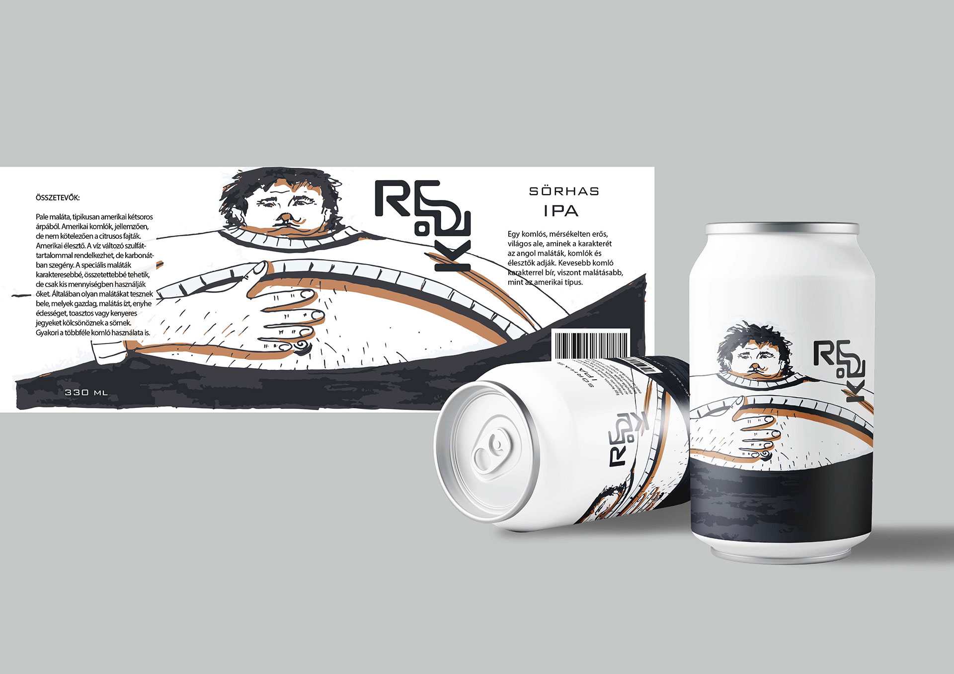
Beer can sticker design
The beer can design features a bold, character-driven illustration inspired by the name “Sörhas,” a playful reference to a beer belly. It depicts a relaxed man enjoying a drink, with a light, humorous nod to classic pub culture.